Behind the scenes of my website
After several months of designing, coding, and writing, I have finally published my website.
UI/UX Design, Frontend Development, Content Creation, DevOps
Me
Design system, Website, Portfolio, Blog, Newsletter
Recursion
Problem
“The shoemaker's son always goes barefoot.” Or maybe “the web developer is offline.” Even though I started learning front-end development a while ago, I've never coded a website for myself. I've been feeling impostor syndrome and thought, “I'm not good enough.” But this way, I could delay it ad infinitum. I've decided to change that. I wanted my corner on the Internet—where I can express myself and share my findings.
Sketches
It's easier to start with pen and paper.
Keeping that in mind, I've started generating ideas. I've made rough sketches of all pages.

It's not Da Vinci-level sketching skills, but they were handy before making wireframes.
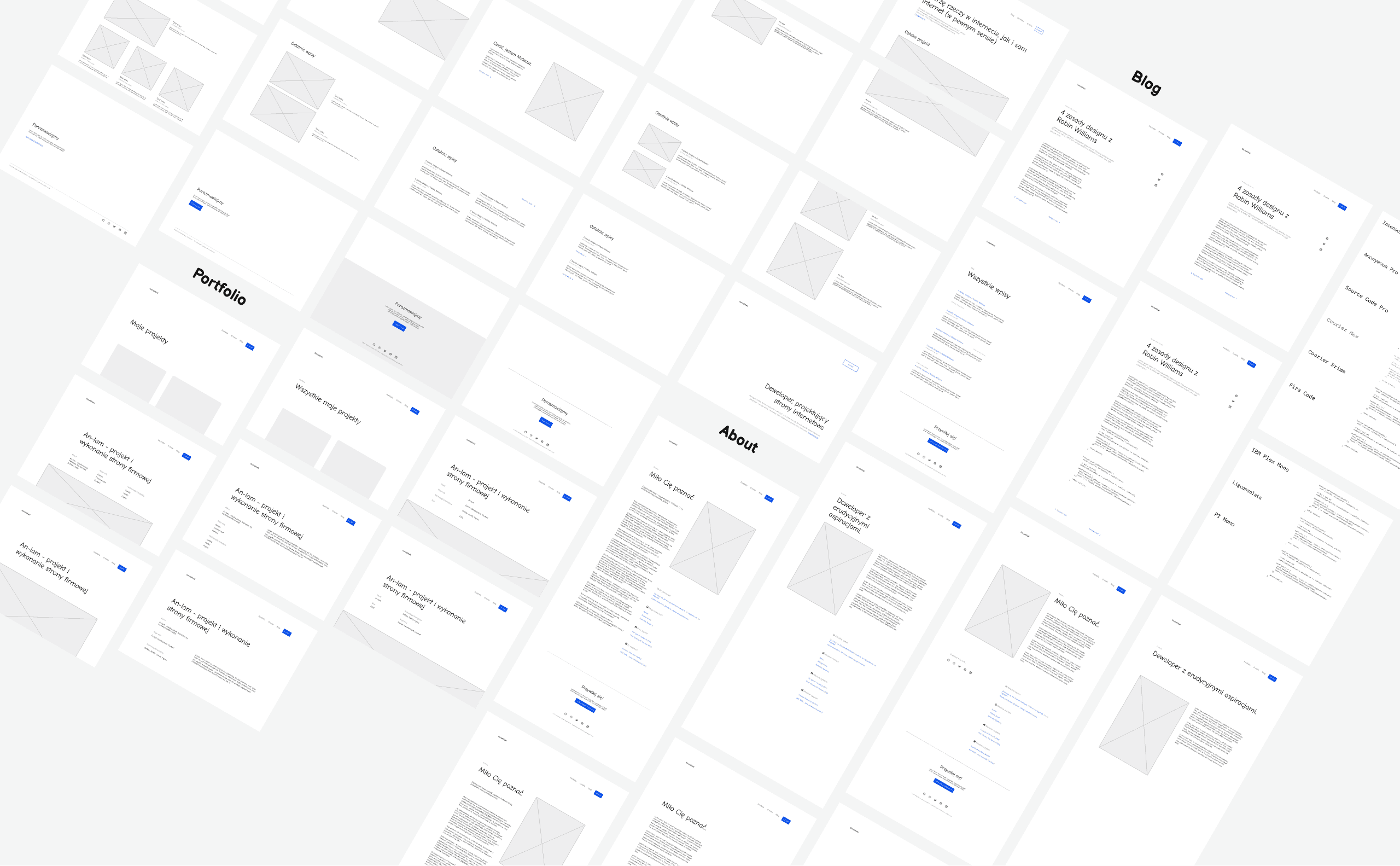
Wireframes
Wireframes should be a middle ground between sketches and higher-fidelity designs and prototypes. Not worrying too much about fonts and colors, I've made numerous wireframes.


Colors
I've spent more time searching for colors than I would like to admit. But after many hours of experimenting (and accessibility testing), I decided the color palette should be minimalistic and simple. It should consist of grays and whites—and, of course, a blue accent. There isn't much thought behind it—I just like blue.

Typography
I wanted this site to be typography-oriented, so I spent another chunk of time looking for typefaces. My goal was to contrast modern sans-serif font with a more classic serif. I also needed a font for code snippets.


Design System
Having essentials and some content, I started to create a design system. I wanted it to be flexible, consistent, and easily scalable. I made abstract design primitives (elements) like buttons and headings. Not only that, but I used them in many contexts to build more complex and concrete components and sections.

Panda CSS is a CSS-in-JS library that allows us to define some base styles alongside multiple variants of a particular component. This way, we define a library of components that is very convenient to use. Here's how the above button component looks in code (I showed only the base styles because the original code is 300 lines long).
import { cva } from '@/styled-system/css'
import { sharedTransitionProperties } from '../../utils'

export const button = cva({
  base: {
    display: 'inline-flex',
    alignItems: 'center',
    gap: 's',
    padding: 's',
    fontFamily: 'heading',
    fontWeight: 'medium',
    letterSpacing: 'wide',
    textDecoration: 'none',
    transitionProperty: 'background-color, color',
    ...sharedTransitionProperties,
    cursor: 'pointer',
    _disabled: {
      cursor: 'not-allowed',
      pointerEvents: 'none'
    },
    '& > .icon': {
      flexShrink: 0
    }
  }
  variants: {
    // Button variants like primary, outline, etc.
  },
  defaultVariants: {
    // Chose default variants when button is used without any
  },
  compoundVariants: [
    // Compound variants allow for more complex logic
  ]
})
And yes—styles are written in TypeScript. It's unusual, but it's really convenient. You don't even need to remember your design tokens—autocompletion has you covered. With design primitives, components, and sections, I created responsive templates for every page.

My design is not finished and is more like a process. I constantly develop it. Therefore, you can play “spot the difference” between this showcase and the current version of my website.

I found that flexibility is desirable during the whole process. Same as breaks—it gives a new perspective. New ideas were occurring at different stages of the process and unexpected moments, like the idea for the progress bar—I found it while surfing the web. Yes, I stole it, and I'm not ashamed of that!
The only art I'll ever study is stuff that I can steal from.
— David Bowie
Gatsby
To implement my website, I used a static site generator—Gatsby. Pages are built and optimized in the generation process, even before the user requests them. Websites created with this approach are usually more efficient than traditional solutions like WordPress.
But if pages are prebuilt, how do you know which theme the user chose? Implementing the theme-switching feature was an unexpected challenge for me. But after reading about Gatsby's build process and testing, I managed to make it work smoothly.
Next.js
“If it ain't broke, don't fix it,” people say. Even though my previous website was working pretty well, working on it became harder and harder. That's why I migrated to a new tech stack. Mostly. It was also an opportunity to learn something new, so Next.js became my new framework. It's also based on React, so I didn't need to learn everything from scratch.
However, those two tools differ significantly. Gatsby has a rich ecosystem of plugins. You're thinking about functionality, and there is probably a plugin providing it. This system is a double-edged sword, however. You can effortlessly implement a new functionality but may have a problem when a plugin is no longer supported. In Next.js, you need to implement more things manually. You need to know better what you're doing, but it's more flexible and easier to maintain in the future.
Testing
Besides manual testing, I wrote automated tests. I used Jest for component testing. Vitest is noticeably faster than Jest, so I switched to it. The migration was pretty easy because the API is similar. To test integration between components and more complex user behavior, I used Cypress with cypress-axe. Those tests cover different website aspects—accessibility, internationalization, SEO, and more.
I also migrated my E2E test suites to Playwright. It offers full parity with Cypress and more. I won't spend much time explaining the differences between these two frameworks because I wrote a blog post comparing them—Playwright vs. Cypress—comparison of E2E testing frameworks.
GitHub
I'll try to add content and features to my website regularly, so long-term maintenance was the aim from the start. I enabled continuous integration with GitHub Actions to minimize the number of bugs and gain more confidence in my project. Every change in the codebase triggers a series of checks and tests.

Playwright runs tests in parallel by default, so I could significantly simplify my CI GitHub Action. Now, it's just one job with a configuration similar to Playwright's default.

I use Conventional Commits to format messages and GitHub Flow as a branching strategy.